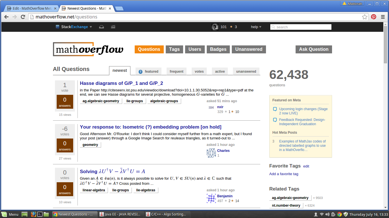
I'm not perfectly sure I understand your proposal.
If you suggest that MathOverflow should look more similar to mathematics.SE, I am against it.
Similarities in the way things work are ok and help users switch between different SE sites.
I think MO and MSE look different enough so that there is no confusion between them.
It should be clear that they are two different sites and it should be clear to a user of both sites which one they are in.
I don't exactly understand how MO looks less organized than MSE.
To me MSE looks less organized because of the inflow of low quality content.
There are many ways to view the two sites.
Can you be more specific about the difference?
The colors in MO could be improved.
It would be nice, for example, if links in comments were easier to recognize.
The distinction between different colors could be more clear (also to users with limited color vision).
Nevertheless, I don't see a big reason to make the site more cool or pretty.
In particular, I don't see a way to do so — many value clarity over prettiness and different people have different views on prettiness.
There were some recent changes to the way SE sites look, including new user pages.
MO is getting these changes later.
It is my understanding that a new look is coming, and then MO would be organized more like MSE (from the point of view of technical arrangements of tabs and such).
 site. Just my view. What do you think?