34
$\begingroup$

The new design theme introduced for MO here is now live. Several issues with the new theme were raised in that discussion. I'd like to discuss one of them, which is sort of buried in my answer and David Roberts' comment to the answer.

(My understanding from this post is that this is StackExchange's plan for dealing with problems arising from the new theme -- to raise them in meta questions. See that post also for discussion of what customization options are available.)

What I'd like to discuss is the following problem:

In the new design, MO looks more similar to MSE than it used to. How can we change this?

This feels like an important issue to me, because

  1. As David Roberts pointed out, new users already have enough difficulty understanding the difference between the two sites.

  2. Many people (like me) are frequent users of both MO and MSE, and I for one would appreciate having more visual cues to remind me which site I'm on.

My general sense is that what used to distinguish MO from MSE was that MSE had the feel of a general StackExchange site with a few customizations whereas MO had a minimalist feel that somehow reflected its independent origins -- an approach that seems to be specifically ruled out in the new design theme.

Therefore I think it's worth considering trying to attain some sort of altogether new look. But I'm not sure what that should be.


Screenshots

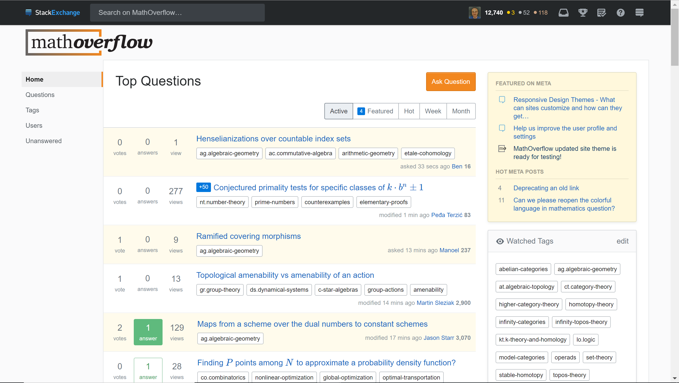
Here are screenshots of the front page for comparison:

MO front page

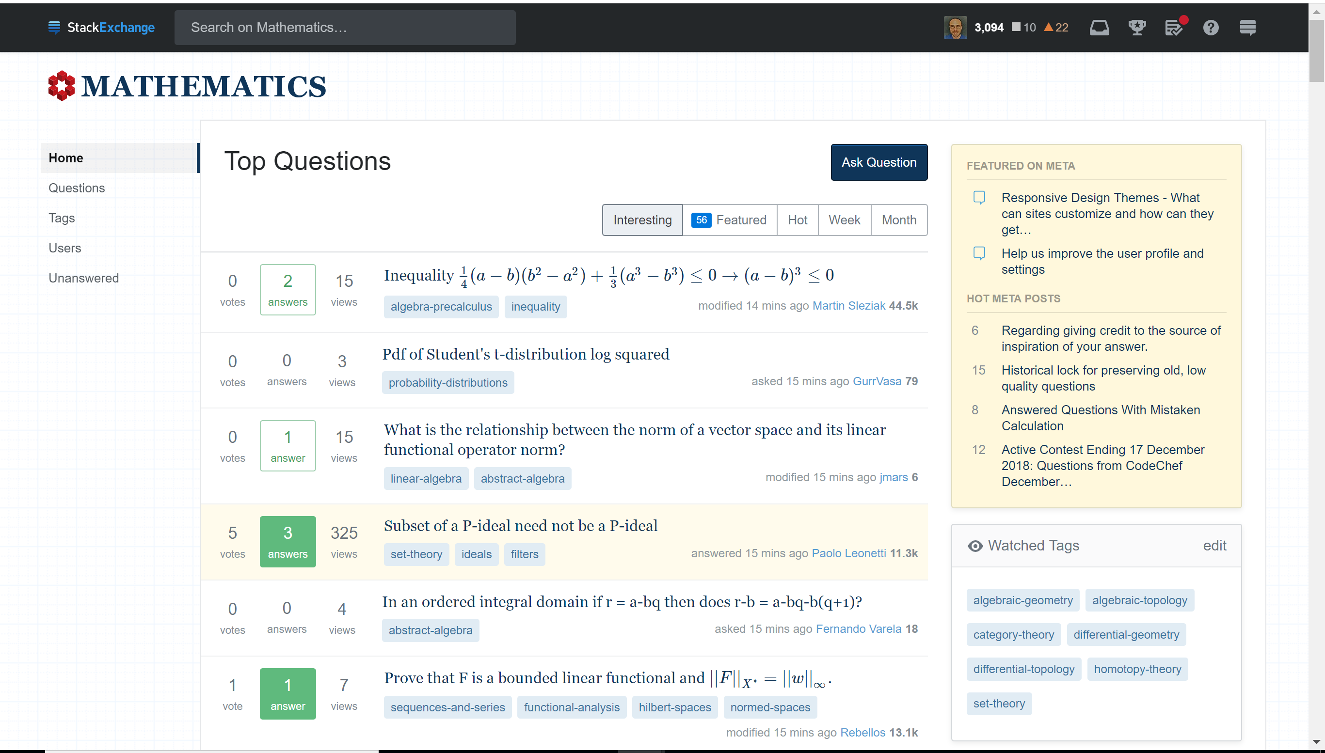
MSE front page

There are certainly differences, though they are subtle:

  1. The headers: one says "mathoverflow" while the other says "mathematics". Of course, this disappears as soon as you start scrolling down.

  2. The background: MO is plain while MSE has their graph paper theme. Once you start scrolling down, this is only visible in the far left region of the page.

  3. The "Ask Question" button: orange for MO, navy for MSE. This also disappears once you scroll down.

  4. In the tabs for which questions you want to view: "Active" for MO, "Interesting" for MSE. Disappears when you scroll down.

  5. Tags: white with an outline and black text for MO, light blue with dark blue text for MSE.

  6. Text: Blue sans serif for MO, black serif for MSE.

  7. "Hot Network Questions": not present on MO (replaced by "Recent Tags" and "Recent Badges"), present on MSE. (Not visible in these screenshots -- this is in the lower right part of the screen.) I'm very glad that this distinction is maintained from the old theme!

I could go on to the interface for asking a new question or viewing an existing question, but the similarities and differences there are really of the same flavor.


What used to distinguish the two sites?

Well, I no longer have access to the old looks of the two sites, so I'm going by memory here.

  1. Carlo Beenakker points out that MO used to have a distinctive color scheme to distinguish questions which were unanswered / answered / answered and accepted.

  2. მამუკა ჯიბლაძე and GNiklasch point out that MO used to have a color scheme highlighting accepted answers.

  3. "Home", "Questions", etc. on the left navigation bar used to be at the top of the page, and I believe MO had a different color scheme for them than MSE did. I'm not sure, but I think these screen elements used to remain at the top when you scrolled down?

  4. I think the graph paper background on MSE used to be visible across more of the screen than it is currently (Now as soon as you scroll down, it's visible only at the far left of the screen).

  5. Overall, I think that MO used to have an "orange and green" feel whereas MSE had a "red and blue" feel. Now both of them feel mostly colorless to me.

  6. I'm not sure, but I think before the left navigation bar was there maybe MO's questions were more flush to the left than MSE's?

  7. In general, I think the old differences were quite subtle, and reflected MO's independent origins.


Some suggestions:

Here are my two cents on things we might consider:

  • We might consider some kind of header / background beyond the plain look we've always had.

  • We might consider asking to re-implement some of the old color distinctions like with unanswered / answered / answered and accepted questions.

  • It sure would be nice if more of the distinctive design elements remained visible when one scrolled down. As it is, the parts of the site which travel with you when you scroll are the black bar at the top and the left navigation column. The only customization I see in these elements is the background (graph paper for MSE) which appears on the left navigation.

  • Maybe we should consider having the words "research mathematics" appear somewhere on the front page? As it is, I don't think it really jumps out from the main page that that's the purpose of this site.


EDIT: In the interest of gauging people's interest, I'm going to start throwing some answers up here. Please upvote if you like / downvote if you don't / discuss in the comments! And of course, add more suggestions as answers!

$\endgroup$
15
  • 12
    $\begingroup$ Maybe we should consider having the words "research mathematics" appear somewhere on the front page? If you access the site without being logged into an account, it already says "MathOverflow is a question and answer site for professional mathematicians". But I agree with you that we should warn new users more prominently that this isn't a site for their homework and has strict standards on what is acceptable. $\endgroup$ Commented Dec 9, 2018 at 21:30
  • 3
    $\begingroup$ Hey MO! Commenting here to be pingable if you have any questions I can help with. Some ideas that aren't in your list - tag colors can be customized to be more different. If the site used to be more green/orange, we could go with green tags with white text. We can also change the color of the question titles in the questions list and links can be colored separately from the titles or they can be the same color. Tags don't scroll but they're more visible in more places. Same with links, which appear to be blue on both sites. $\endgroup$
    – Catija Staff
    Commented Dec 10, 2018 at 4:57
  • 10
    $\begingroup$ Just put it back the way it was please. It worked fine. It wasn't broken and didn't need fixing. $\endgroup$
    – none
    Commented Dec 10, 2018 at 7:32
  • 6
    $\begingroup$ @Catija Could you clarify why SE is using color schemes that are so similar with each other for different sites? For me this is the main reason why all sites feel the same (note that I am colorblind, so my color perception could be different from the "standard" one) $\endgroup$ Commented Dec 10, 2018 at 10:19
  • 10
    $\begingroup$ @none: From the user end, it was great before. But StackExchange has explained in various places that one of the motivations for the change was about work behind the scenes: maintaining many highly divergent sites was a lot more labour-intensive for them than maintaining a single more unified codebase. This seems a fair reason — unlike the claimed “improvements” for users, which I agree feel more like a step backwards. So the approach of this question seems much fairer, and more likely to succeed, than asking for a full rollback. $\endgroup$ Commented Dec 10, 2018 at 10:31
  • $\begingroup$ @DenisNardin It may depend on which sites you use. Many of the sites have design elements that set them apart from others but some sites definitely end up looking very much the same - particularly, I'm guessing, for users like yourself who may not be able to see color differences. We're working on accessibility concerns for the entire network but that won't really address the sites looking the same. We've long had the problem of having difficulty adding new features to the network because the sites' CSS were so different, we'd spend as much time fixing bugs as developing the feature. $\endgroup$
    – Catija Staff
    Commented Dec 10, 2018 at 21:39
  • 1
    $\begingroup$ This simplification of the site designs is our solution to get away from a mountain of technical debt in preference of simplicity and rolling out features people have been wanting for years. Cleaning this up is removing something like 16k lines of code for site-specific customizations. It's also giving us a home base (the left sidebar) for projects we're working on like Custom Questions Lists and it gives us a place to host Teams navigation, which is currently Stack Overflow-specific. Another feature is the responsive nature of the pages, which we've had long-time outstanding requests for. $\endgroup$
    – Catija Staff
    Commented Dec 10, 2018 at 21:42
  • $\begingroup$ Also, beyond the color differences, every distinction that is not in the "central column" (where Q&A or the list of questions are) is going to be essentially invisible for me. I don't think I'm the only one that looks only at the central column while navigating the site. $\endgroup$ Commented Dec 11, 2018 at 10:52
  • 5
    $\begingroup$ @Catija Sounds like you are suggesting a false dichotomy here. You can have visually different sites even without the technical debt of maintaining many lines of code. A couple of color statement in a CSS, a different background pattern and a few custom buttons are enough to differentiate them visually. $\endgroup$ Commented Dec 11, 2018 at 10:53
  • 3
    $\begingroup$ WHY? It seems to me a big mathoverflow at the top is enough to differentiate "us" from "them". $\endgroup$ Commented Dec 11, 2018 at 12:41
  • 11
    $\begingroup$ @GeraldEdgar As somebody who uses both sites, and often has multiple tabs from each site open in my browser at a time, I would personally prefer to have more visual cues differentiating the two sites than there are currently. $\endgroup$ Commented Dec 11, 2018 at 12:45
  • 3
    $\begingroup$ Since you listed the differences, perhaps this is worth adding to the list. (It's easy to miss, but OTOH it remains even when I scroll.) On most pages - and when I haven't recently done some search on the site - I see in the top bar "Search on MathOverflow" vs. "Search on Mathematics". $\endgroup$ Commented Dec 11, 2018 at 18:53
  • 3
    $\begingroup$ Big fan of the color orange here =]! $\endgroup$ Commented Dec 12, 2018 at 8:47
  • 1
    $\begingroup$ @FedericoPoloni I think that Jon explains it a bit better than I could: meta.stackexchange.com/questions/319089/… We want to make intentional choices rather than haphazard ones. A couple of color statements here and there is what got us where we are right now.... with extremely complex and different sites... but nothing you mention in your comment is out of the realm of possibility. Tag colors and background colors/patterns are customizable. $\endgroup$
    – Catija Staff
    Commented Dec 12, 2018 at 19:58
  • 1
    $\begingroup$ To repeat what I said in chat: when the window width is narrow enough to switch to a mobile layout, the 'Search on MathOverflow/Mathematics/Generic.SE.site' vanishes, leaving no sign when scrolled down, just the StackExchange logo. $\endgroup$
    – David Roberts Mod
    Commented Dec 15, 2018 at 6:21

6 Answers 6

17
$\begingroup$

As a data point for our Stack Exchange overlords, I have twice now tried to migrate a question from math.SE to math.SE because I didn't realize it was already there. I'd really like to get a striking difference in color and background.

$\endgroup$
0
17
$\begingroup$

EDIT: Some more information from Catija: This screen element is not currently customizable, so if we wanted it customized, SE would have to implement a new feature. Here Catija indicates that the current SE thinking is that this particular screen element ought to be something which looks the same across the whole SE network. But here she indicates that on the timescale of a year or so, they might revisit this screen element, and either change it network-wide or make it customizable.

See also Catija's latest comments over on Carlo Beenakker's original post.


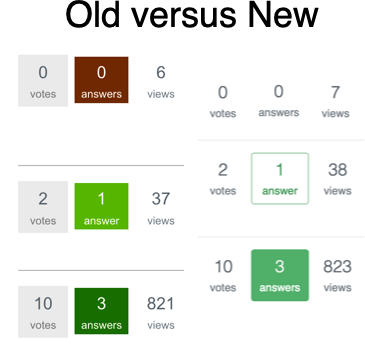
I really like Carlo Beenakker's point about the color scheme that MO used to have for unanswered / answered / answered and accepted questions (brownish / light yellow-green / green), along with the little gray box around the vote count. These boxes also had sharp rather than rounded corners. Here's Carlo's screenshot:

enter image description here

It had a lot going for it:

  1. It made unanswered questions jump out more. In the current scheme, it's the answered and accepted questions which jump off the page -- the "dead" ones so to speak, which is kind of backwards.

  2. The vote counts / answer counts / view counts are one of the most commonly-recurring screen elements on the front page, so customizing them added a good bit to the unique feel of MO.

Bringing back that old color scheme seems like a small change which could go some ways toward making MO feel more distinctive.

From the discussion on Carlo Beenakker's response to the other question, it sounds like StackExchange doesn't currently support this customization, but

  1. This seems like a very generic customization that many sites could potentially be interested in using, especially in light of (2) above.

This wouldn't address the feel of the pages for particular questions, but I think it would help the front page.


I've posted essentially the same answer to the site-wide meta discussion. I get the sense that StackExchange would be more likely to implement something like this if we could generate interest from other sites as well.


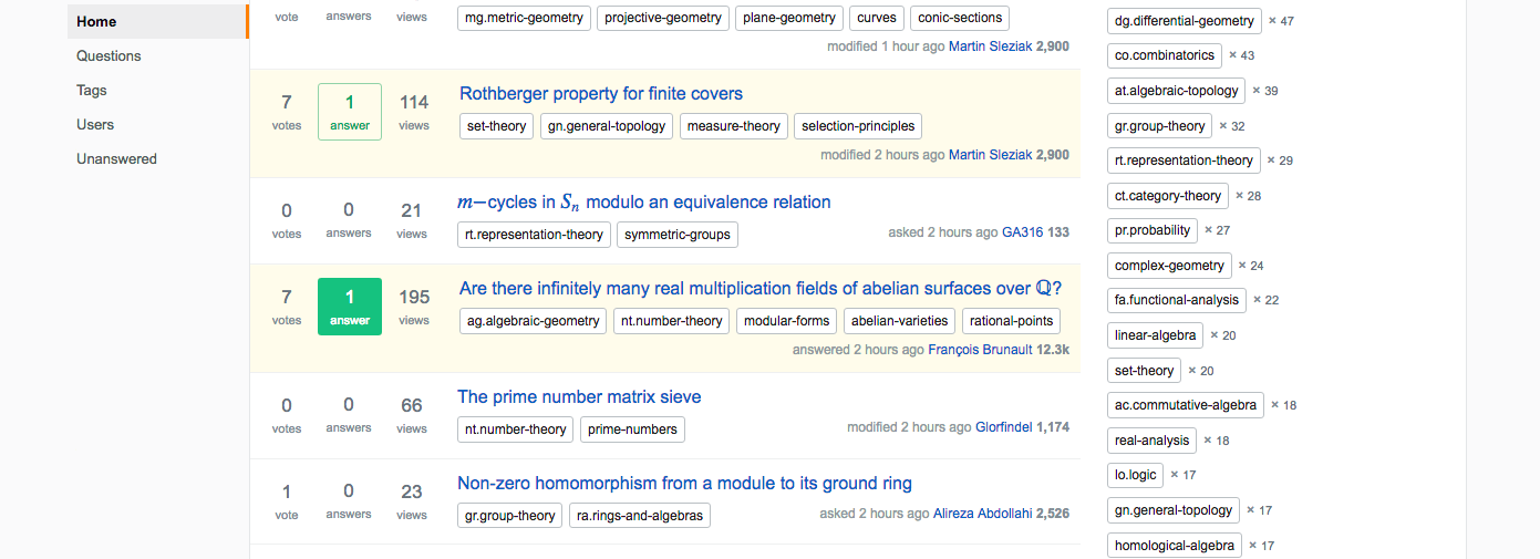
Here are a couple of screenshots to illustrate how this customization used to add some color to the environment a la (2) above. Here's what the front page of Mathoverflow looks like now when you scroll down:

Mathoverflow front page -- new

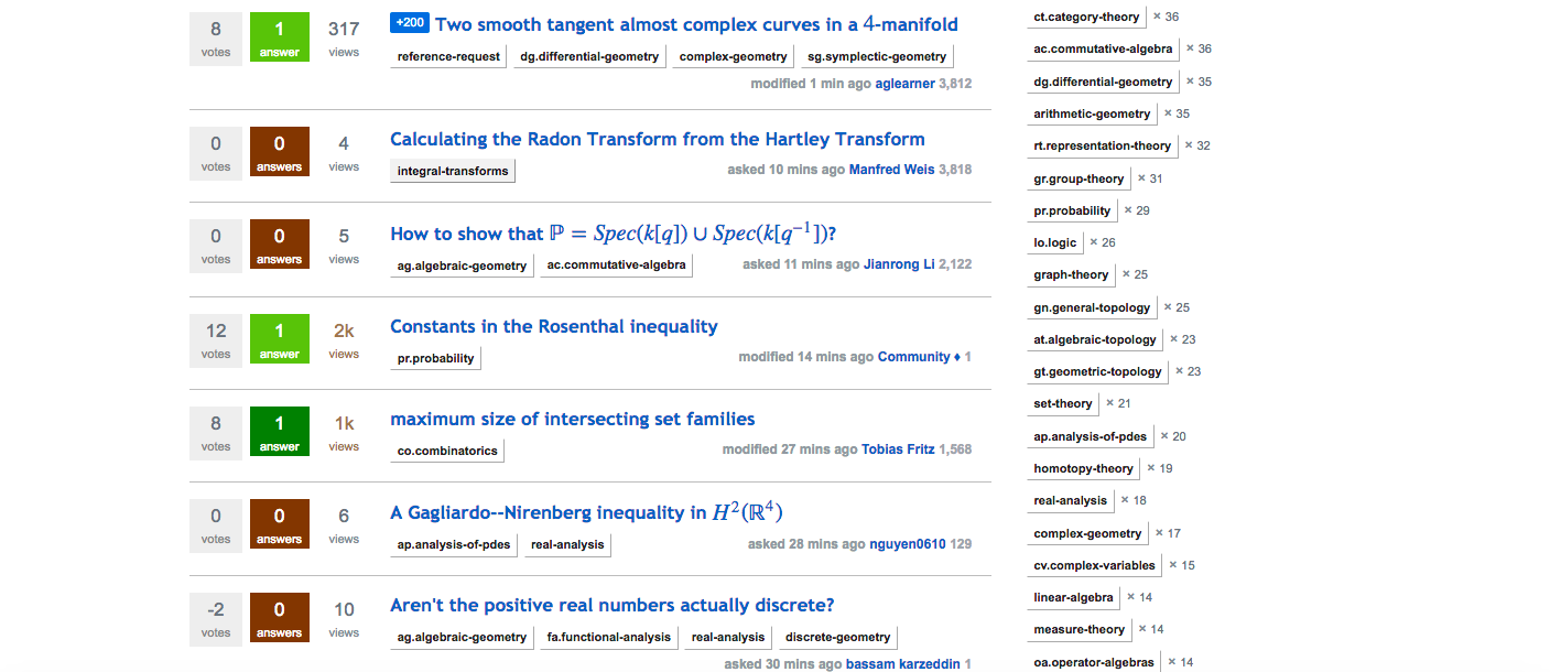
And here's what it used to look like (courtesy of the Wayback machine):

Mathoverflow front page -- old

To me, the new version is rather colorless compared to the old one. I find it striking that even though Mathoverflow had a plain white background in the old theme, this one customization saved the site from looking colorless.

$\endgroup$
6
  • 2
    $\begingroup$ +1, I'd really love if MO could go back to something approaching the old color scheme. I realize they don't want to make the codebase explode, but controlling the colors of the main elements really shouldn't be that hard. $\endgroup$ Commented Dec 13, 2018 at 11:11
  • 1
    $\begingroup$ My feeling is that the previous scheme, placing a color emphasis on whether an answer was accepted or not, tended to discourage engagement with questions having an accepted answer. People wouldn't click through to look at them, if they were already answered, even when there were interesting new posts with new ideas or issues. $\endgroup$ Commented Dec 13, 2018 at 12:49
  • 1
    $\begingroup$ @JoelDavidHamkins That's a fair point, but for me a few thoughts come to mind. 1. For a question with an accepted answer it's supposed to be less likely that there remains something interesting to be added on the topic. 2. I'd actually argue that the new scheme puts more emphasis on the distinction between accepted and nonaccepted answers (because the green frame for nonaccepted answers is not that different from the blank frame for unanswered questions, whereas in the old scheme it's the light green which is not that different from the dark green). $\endgroup$ Commented Dec 13, 2018 at 17:37
  • $\begingroup$ 3. I wonder if some of the dynamic you describe could be attributed to other differences in how accepted answers are handled. For instance, I might be wrong but I think a question with an accepted answer doesn't get bumped to the front page when a new answer or edit is made. 4. There might also be the possibility of asking for this customization, and then choosing a different color scheme altogether, neither the old one nor the current one. $\endgroup$ Commented Dec 13, 2018 at 17:37
  • $\begingroup$ I disagree with 1, since I know of numerous instances where something was definitely added after the accept, and then it got little attention. You might be right about 2, and in that case I'd argue as in 4 for not indicating the information so explicitly. I don't think you are right about 3, since I've often posted on such questions, and they bump. $\endgroup$ Commented Dec 13, 2018 at 17:41
  • $\begingroup$ @TimCampion Accepted answer does not influence whether or not a question is bumped. More details on bumping (and a further link to rather long FAQ post) can be found in the corresponding tag-info. $\endgroup$ Commented Jan 7, 2019 at 18:59
7
$\begingroup$

I suggest that we leave the job to Stack Exchange's design team. I'm not sure why we are supposed to come up with a solution ourselves; we are not professionals, and surely SE has someone on staff whose job is coming up with good site designs. I like many of their designs that were on other sites in the network before this change.

What worries me, though, is that everyone has been complaining about these two sites looking the same for days here and yet there does not seem to be any interest on their part on fixing it. The only message we got regarding their roadmap seems to imply that this issue isn't even on it: "We're working on accessibility concerns for the entire network but that won't really address the sites looking the same."

$\endgroup$
3
  • $\begingroup$ Note that there has been further discussion on this topic in the chat. $\endgroup$ Commented Dec 14, 2018 at 23:07
  • 1
    $\begingroup$ @FedericoPoloni The way you linked to the chat, it will always show the transcript with the most recent messages in that chat room. I will add a link to December 14 in the transcript. I believe that near the top of this part of the transcript is the discussion you're referring to. (I left a brief explanation what are various option how to link to discussions in chat elsewhere - it's unrelated to this issue.) $\endgroup$ Commented Dec 15, 2018 at 5:58
  • $\begingroup$ Oops thanks @MartinSleziak $\endgroup$ Commented Dec 15, 2018 at 8:49
6
$\begingroup$

According to the post on Meta Stack Exchange1 (and the stuff I was told in chat) it seems that color of tags can be changed. (To be more specific, Catija mentioned as an example of a site which changed looks of tags from defaults Mi Yodeya.)

Maybe simply changing background colors for the tags would help to made the site distinguishable from others. Perhaps this would not help too much when looking at an individual question - after you scroll down you no longer see the tags. But there are many pages with lists of question that users of the site quite often look at, on those pages the tags are displayed quite often and having differently looking tags would make differentiating between the sites easier.

I would suggest some color which is not too bright - but still at least noticeable. (I'll mention that I am not very familiar with CSS, so probably somebody with better technical knowledge might have some better suggestions.) I have tried some of the colors listed here. (For visual samples of the colors used here see also: https://stackoverflow.design/product/base/colors.) The only thing I was changing was background-color.

This is what I get for @black-100: lighten(@black,80%); // #D6D8DB:

black-100

This is what I get for @blue-050: lighten(@blue,55%); // #e6f4ff: blue-050


1Emphasis mine: "Colors can be customized to a degree (and many have been adjusted through this process). This includes buttons, OP indicator boxes, link colors (visited/unvisited), voting arrow colors, tag colors (background & text), question titles (in the questions list, not on question pages)."

$\endgroup$
5
$\begingroup$

We could consider some kind of background theme. I think MSE's graph paper looks pretty good. Of course, the goal would be to come up with something good which contrasts to the MSE graph paper.

If we did this, I imagine we'd want to solicit particular suggestions from the community and then vote on them.

$\endgroup$
5
  • $\begingroup$ Both this and the artwork are great options. Feel free to start new questions/discussions for this and we'll look at what you come up with... Please note that for the background, it must be light enough that black text is clearly visible on it (for the left navigation). I outline some of this in my Meta.SE post but if you have any questions, let me know. $\endgroup$
    – Catija Staff
    Commented Dec 14, 2018 at 17:34
  • 5
    $\begingroup$ giant spectral sequence background $\endgroup$ Commented Dec 15, 2018 at 1:42
  • $\begingroup$ Maybe just a simple colour would be enough, though? Quite some SE sites seem to use that, and I find it quite effective. Maybe a light orange? $\endgroup$
    – Max Horn
    Commented Dec 18, 2018 at 11:16
  • $\begingroup$ I've asked a separate question now entirely about the background. $\endgroup$ Commented Dec 18, 2018 at 17:33
  • $\begingroup$ I'm not that bothered about the new design in general... except that with all the white space everywhere I feel kind of dazzled when I look at the site, and don't find it comfortable to read the text. Any background that alleviated dazzle would be helpful for me. $\endgroup$
    – Nick Gill
    Commented Dec 20, 2018 at 11:56
2
$\begingroup$

We could consider choosing some kind of art in the header of the page.

MO has always had a "plain" sort of theme, but maybe it's time for something new.

If we did this, I imagine we'd want to solicit particular suggestions from the community and then vote on it.

$\endgroup$
2
  • $\begingroup$ Art is a great way to make the site unique. It can be a full-width pattern like Photography or a single image like Role-playing Games or Worldbuilding. With the latter, be aware that with responsive design, we limit the artwork width to prevent it from overlapping with the logo, though it can be integrated somewhat - see Movies & TV for an example. $\endgroup$
    – Catija Staff
    Commented Dec 14, 2018 at 17:37
  • $\begingroup$ I'm actually more than happy with the current MO header. Moreover the header is not in view for most of the navigation throughout the site (even when looking at the main page, the header is quickly hidden by scrolling). Maybe some art in the side bar is a good idea, though what kind of art I cannot fathom... $\endgroup$ Commented Dec 22, 2018 at 22:03

You must log in to answer this question.

Not the answer you're looking for? Browse other questions tagged .