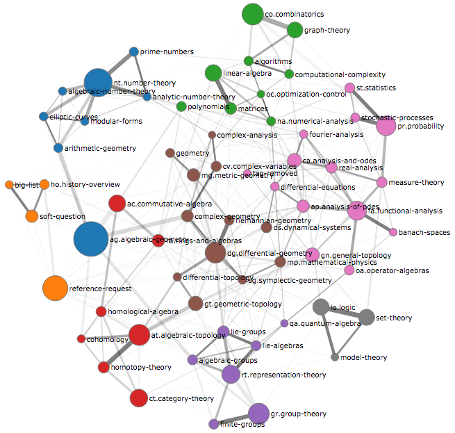
I created a graph of tags from Stack Exchange sites (including MathOverflow), TagOverflow.
It is a continuation on my previous project - plots with static graphs and (sadly) without MO (due to API differences - i.e. lack of such for MO at this time).
Nodes represent the most popular tags, with their area being proportional to the number of questions with them.
Edges represent relation between tags. Their width is related to the number of questions with both tags, while their shade - how much more often they occur than one should expect by random chance.
Default coloring is due to community detection - automated splitting of a graph into densely connected subgraphs. Positions of the nodes are due to D3.js force layout. That is, nodes connected via an edge attract each other. The strength of such attraction depends on the strength of an edge. Plus, all nodes repeal each other at a short distance to prevent overlaps.
Code and description is on GitHub.
Besides looking at the graph, you can:
- get interesting information per tag (e.g. top questions and users),
- get some statistics (like average score for these tags).
I hope you enjoy it!
Also, if you have comments how to improve its usefulness or niceness to our community, I would appreciate them. And if you get any insights from this tool, I would be happy if you could share them.


nt.number-theorywhich is not on your image. And that tag there is moreover not connected to any other tags. Does it mean number theory is sort of an isolated topic at MO?? $\endgroup$ag.algebraic-geometry, etc.? $\endgroup$